
At Burlington Paint and Sip Studio, we believe that anyone can paint—and we know that a little understanding of color theory can go a long way in boosting your confidence and creativity! Whether you’re brand-new to painting or a seasoned sipper with a few canvases under your belt, getting to know the basics of color theory can help you mix, match, and create like a pro.
What Is Color Theory, Anyway?
Color theory is the art and science of how colors work together. It helps artists understand how to mix paints, create mood, and make their work pop. Don’t worry—this isn’t like high school chemistry. Think of it as a toolkit to help you pick the right colors for the masterpiece you’ll be sipping and creating.
Meet the Color Wheel
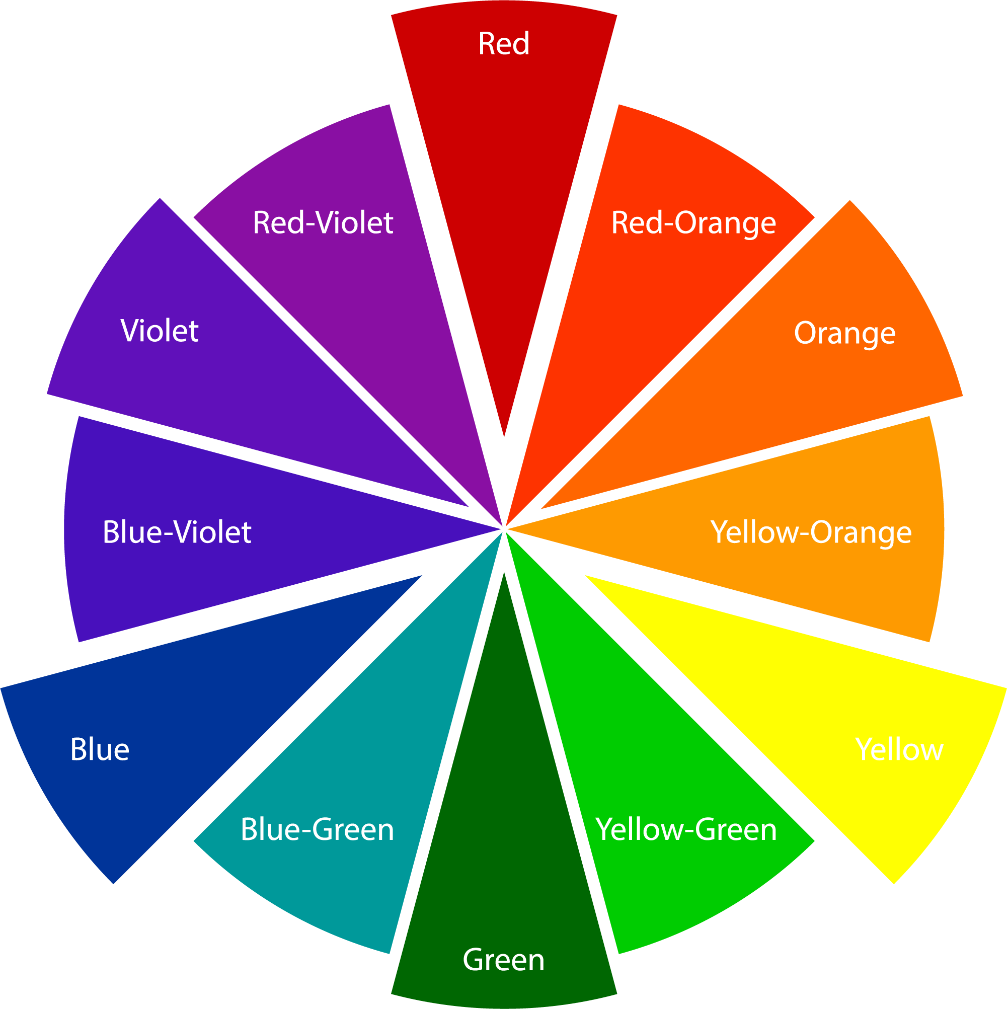
At the heart of color theory is the color wheel. It’s like a painter’s compass, showing how primary, secondary, and tertiary colors relate to one another.
- Primary colors: Red, blue, and yellow. These colors can’t be made by mixing other colors together.
- Secondary colors: Orange, green, and purple. These are made by mixing two primary colors.
- Tertiary colors: These are the in-betweens, like red-orange or blue-green—created by mixing a primary and a secondary color.
Color Harmony: Making Your Painting Sing
Ever wonder why some color combos just work? That’s called color harmony, and it’s what gives your painting balance and beauty. Here are a few simple ways to use it:
- Complementary colors: Opposites on the color wheel (like blue and orange). They make each other pop!
- Analogous colors: Neighbors on the wheel (like yellow, yellow-green, and green). They create a calming, cohesive look.
- Triadic colors: Three colors evenly spaced around the wheel (like red, yellow, and blue). Perfect for a bold, balanced vibe.
Warm vs. Cool Colors
Color also has temperature!
- Warm colors (reds, oranges, yellows) bring energy and warmth.
- Cool colors (blues, greens, purples) feel calm and soothing.
At your next session, try using warm tones for a sunny beach scene or cool hues for a moody mountain view.
Pro Tips for Painting at Our Studio
- Don’t be afraid to experiment: Want a more vibrant sunset? Add a touch of red to your orange. Looking for a peaceful sky? Mix a bit of white into your blue for a soft pastel tone.
- Ask your artist: Our talented staff are always happy to help you mix just the right shade.
- Trust your instincts: Art is personal. If it feels right, it is right!
Final Sip
Understanding color theory is like learning the secret language of art—it opens up a world of creative possibilities. So next time you join us at Burlington Paint and Sip Studio, grab that brush, pour that wine, and let your colors fly! Cheers!